Pie (Chart) Life
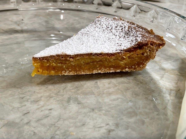
OK, I know. First cake. Now it’s pie.
Let me be clear at the outset that I love pie.
Just not for data viz.
For many years, #dataviz gurus have been advising us to not use pie charts, or at least, not use them inappropriately. For the love of pie, I agree.
What is an inappropriate use of a pie chart? Let me count the ways.....
The most frequent not-so-great ways I see #nonprofits and #coalitons use pie charts are when depicting data with more than 3 categories, 3-D slices, or situations where the slices do not add up to 100%.
If you are trying to depict your data and you have more than 2 or 3 categories, consider all of the many fun ways you can depict your data. Bar charts, stacked bars, donut charts, waffle charts and so many more.
Check out these posts to learn more for one of the best in the #dataviz world, Ann Emery.
For a basic rundown on when it is OK to use Pie Charts, check out Ann’s blog here. For some more advanced information, check out another of her blogs here.
Ann will be my guest on Community Possibilities (look for that episode to go live in a few weeks), talking about using data to promote equity and to educate communities.
Speaking of the podcast, check out my latest episode of Communities Possibilities with LaTreece Roby. LaTreece is the Director of the Cobb Community Alliance to Prevent Substance Abuse (CCAPSA), a Drug Free #coalition in Kennesaw, Georgia. Be sure to like and share!
Take Care friends!
P.S. Are you a coalition or nonprofit leader and need help getting started measuring your outcomes? Download my free guide.
Ann

